 YB.Digital
A Practical Guide to Article Master Data in SAP IS-Retail
Master the article master end to end: merchandise categories, variants, listing, and the fields that actually matter in a live retail system.
Start on MMCSAP IS-Retail expert · Online educator
I've taught SAP IS-Retail to more than 130,000 students worldwide, built a multilingual content business in 6 languages, and I share exactly how on my podcast, Build With What You Know.
Training
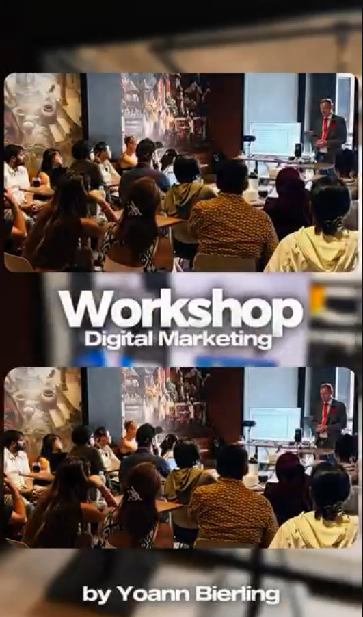
I spent 7+ years deploying SAP IS-Retail across Europe, Africa, and the Middle East before turning that experience into hands-on video training. Every course is recorded live on a real S/4HANA retail system, so you learn the transactions, the pitfalls, and the workarounds that only show up in real projects.
Master the article master end to end: merchandise categories, variants, listing, and the fields that actually matter in a live retail system.
Start on MMCIndustry-specific article creation across Fashion, Grocery, Pharmacy, Hardlines, and FMCG — one deep-dive demo per industry.
Join the waitlistBrowse the complete catalog on Michael Management and Udemy, from beginner navigation to consultant-level retail processes.
Browse all coursesNot sure where to start? Email me at yoann@yb.digital and tell me about your project.
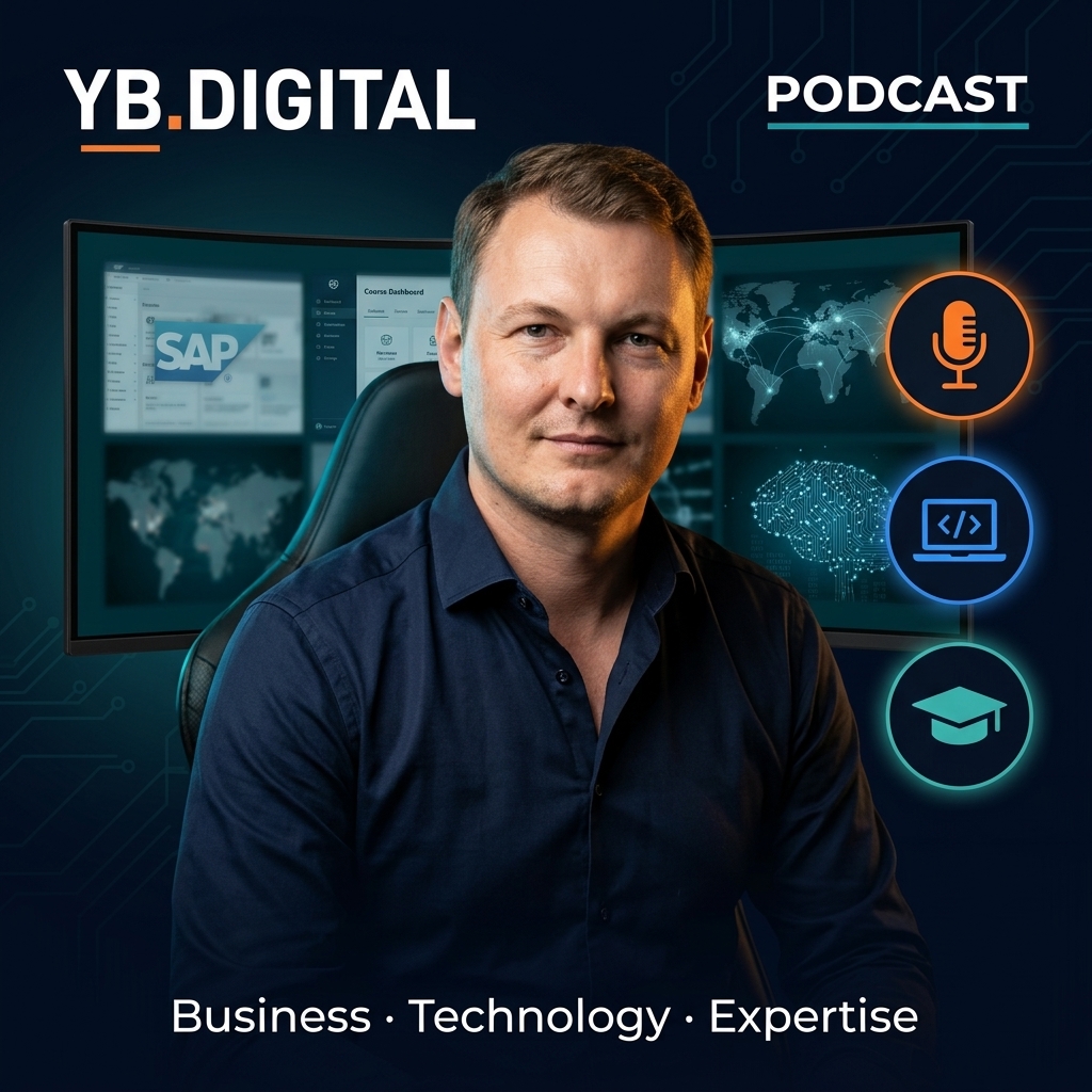
Podcast
Conversations about turning professional expertise into online business — courses, content, affiliate revenue, and the AI workflows that make one person operate like a team. Real numbers, real experiments, no fluff.
My stack
Some links below are affiliate links. If you buy through them, I earn a commission at no extra cost to you — I only list tools I use in my own workflow.
How I turn one recording into videos in 6 languages, without re-filming a single take.
See it in actionMy editor for fast social clips and repurposed content across every channel.
Try FlexClipThe platform I recommend to launch and sell your own courses under your brand.
Start your academyHow I find winning products before spending a cent on inventory or ads.
Find winning productsThe marketplaces I use to value and trade content sites.
FlippaEvery click our readers and viewers send to the courses, tools and partners we recommend is tracked, categorized, and shown publicly — updated daily, generated automatically, shared on our socials every morning.
See the live dashboard → No login. No signup. Just the real numbers.Free content
I publish SAP training, AI tool walkthroughs, and online business content on YouTube across six channels.
Latest articles
Guides on SAP, digital tools, and building online income — the three newest articles appear here automatically.
The story
I started at Accenture deploying SAP retail systems across three continents, launched my first online course in 2019, and have been building YB.Digital ever since — 30+ websites, six YouTube channels, and a podcast, run from wherever I've plugged in my laptop, from Strasbourg to Bali.
Read the full storyContact
Press and podcast interviews, SAP training questions, or partnership ideas — email me or connect on LinkedIn.